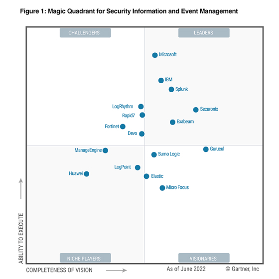
2022 Gartner® Magic Quadrant™ SIEM
Get the report
MoreTrusted by thousands of customers globally.
Browse our library of ebooks, briefs, reports, case studies, webinars & more.
March 4, 2021
With almost every blog you read about monitoring, troubleshooting, or more recently, the observability of modern application stacks, you’ve probably read a statement saying that complexity is growing as a demand for more elasticity increases which makes management of these applications increasingly difficult.
This blog will be no exception, but there’s a good reason for that: we just enabled the first Sumo Logic customers with powerful new tools to tackle these exact challenges.
Imagine an application that has a few dozens of interconnected services. Imagine most of those services have cross-service dependencies. How do you understand these relationships? How do you troubleshoot if one of them breaks? What happens when you get errors and alerts after dozens are affected at the same time?
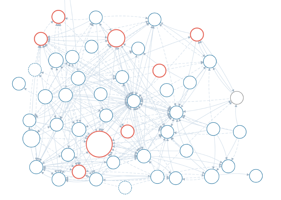
You need to know who’s talking to whom, which microservice depends on each other, and what is the last element in the failure chain that started the whole alert stream.
Distributed tracing is an observability approach that helps exactly in such scenarios, but let’s keep in mind that checking individual trace, or even a set of individual traces, might be quite good for an isolated, very well-identified problem that is distinct in time. For instance,you have a transaction id and the customer name and can search for it, also in distinct time. Although in every complex enough application, there’s a multitude of different transaction types, and it is often important to take a wider, higher point of view at what’s going on.
A Service Map view is a perfect answer when you want a wider visibility, or when you need to better understand whether a designed information flow is correct and effective, or when you need a quick at-a-glance picture of the health of your microservices and their dependent or supporting neighbors. This view is perfect when you are not so much interested in detailed calls and error codes of a specific transaction.
We have just added a similar view into the Sumo Logic Observability platform, allowing you, out of the box, without any configuration, to get a real-time view of the following:
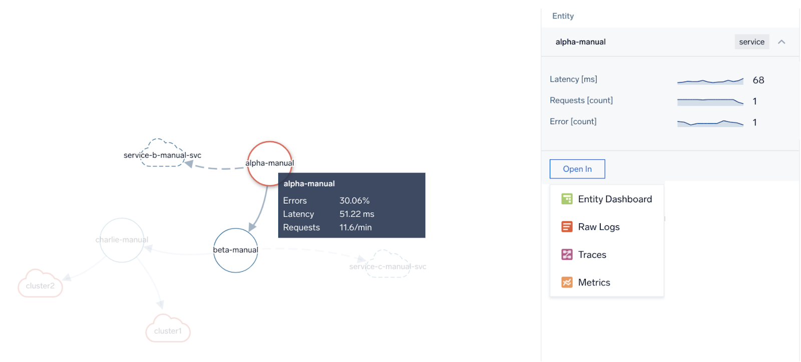
You can also search for services of your choice or filter the map by application name which you can set in your span attributes, to focus only on services that interest you. Hovering over the service focuses on dependencies and clicking on it leads you to the Service Dashboard (see below) where you can better understand its health and it further links directly to Trace Query/List to see traces flowing through it.
So, how might I use this view to get the most out of its benefits? Is everything connecting to what it should be? In a purely exploratory use case tocheck what’s active, to know what’s talking to what, and to verify our imagination and design of our environment with reality, what might I need to know? Are there any redundant, obsolete services in use? Are services correctly using their downstream peers? What external (remote) services they are calling? All of that is visible at a glance in this view.
There is a way to see the health of each microservice. Each bubble size and color indicates the load and health of each microservice. This allows you not only to understand what are the main busy crossroads of your application traffic, but also to quickly detect anomalous behavior of your services in terms of their response time and error responses. If you need more detailed information, simply click on a service. The right side pane shows you the most important KPIs in function of time with the possibility of further drilldowns to traces or detailed Service Dashboards.
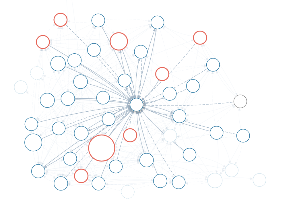
A final note on the Service Map. If errors or increased latency propagates upstream by a service being a root cause of it, it will be visible clearly on the Service Map as a chain of red, stopping at the service at fault. For not very specific or intermittent problems, it is easy to perform initial fault domain troubleshooting by looking at how the “red flows downstream” on the Service Map. Here’s how such a scenario reflects itself on the Map versus in the individual example transaction trace. In both cases, we see that the main latency contributor is “the-coffee-machine” service.
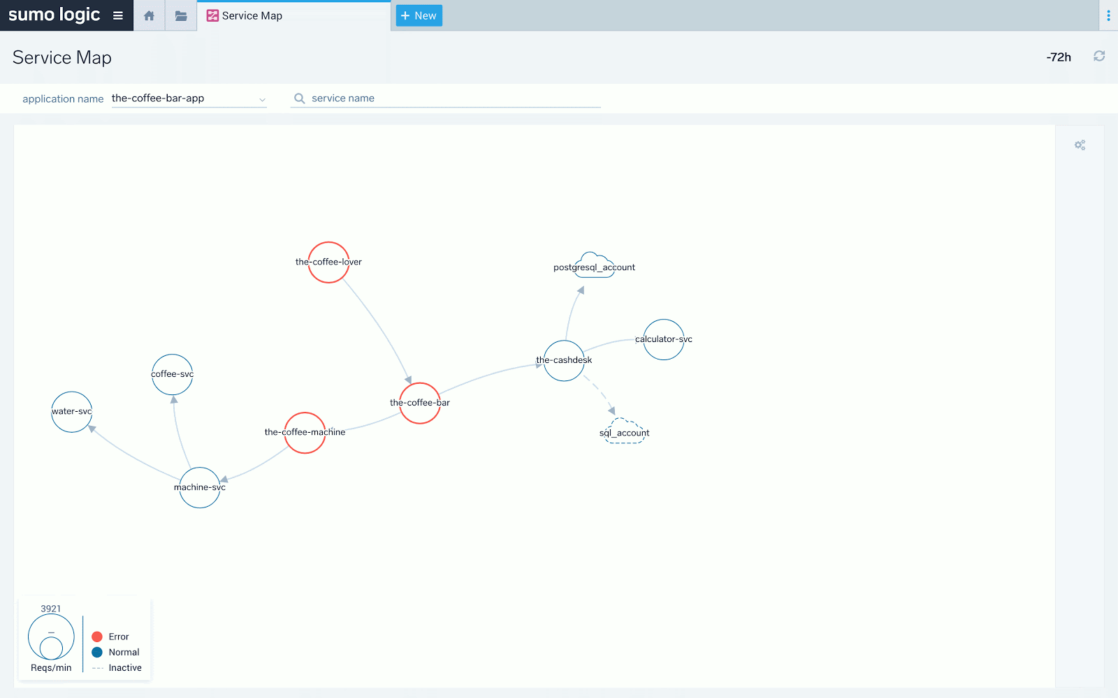
Above we see the red “stops” at “the-coffee-machine” service. The downstream “machine-svc” service does not have red and its latency doesn't spike to over 2 seconds as others. The latency problem detected at front end service “the-coffee-lover” propagates down from “the-coffee-bar” and to “the-coffee-machine” only.

The same is visible above in the actual transaction trace taken from a sample list of traces available as drill down from the previous screen under “Open in -> Traces”. We can re-confirm that the main latency contributor is “the-coffee-machine,” which is represented by maroon-colored spans.
Nice, we found a problem with service latency! What if we want to find other services with latency problems? What about errors? What if we want to see what are the most loaded services in our environment? You most likely noticed 3 screenshots above that there was a small green “Open in Entity Dashboard” icon. Let’s dive into it.
We already know that inspecting a single trace may be useful, but is narrowing our analysis to a single transaction. There may be millions of them. Millions per minute. So, how do we get “the big picture”?
I have some great news for you - it is enough to start sending OpenTelemetry compatible tracing data to Sumo Logic and to be able to enjoy the nice insights into application service health by analyzing their KPIs that we automatically generate out of the box for you based on raw tracing data. No additional configuration, metrics ingest or calculation on your side is required! Just open the Explore view and enjoy the visibility of your application environment as never before.
You can also automatically slice and dice your data assigning them to “Applications,” which is a grouping concept that reflects how your services are working together to deliver business functions. For example you can split your services between “Shopping” application and “Payments” application.
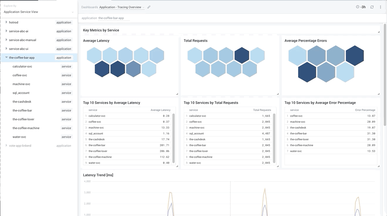
Such a view allows you not only to understand what are the slowest services or the ones that have the most errors, but also to notice any intermittent spikes in application behavior and quickly send your analysis into a specific service, or a subset of traces that represent the problem.

By comparing service latencies together, you can drive similar conclusions as we have found above on the Service Map, with the additional background that such a problem happens every hour and lasts just 5 minutes. Is it time to check some resource-intensive periodic tasks that can interfere with your app?

Above we see that, indeed, just three top services -- the-coffee-lover, the-coffee-bar, and the-coffee-machine -- experience latency spikes every hour; therefore, the problem must come from the last one as it is the most downstream service. We already learned that earlier from Service Map. We also see correlated requests dip, indicating business lost due to this latency. Because of our coffee machine being slow, we sold 25% coffee less than usual!
Regardless of your use case, I am pretty sure that you will find these new additions to our distributed tracing support in Sumo Logic Observability very useful and valuable. If you want to start your experience with tracing, contact the Sumo Logic account team. If you want to learn more and you are already a customer, find us in #sumo-tracing slack channel in Sumo Dojo. We anxiously wait for your feedback and comments to improve our services for you.
Reduce downtime and move from reactive to proactive monitoring.
Build, run, and secure modern applications and cloud infrastructures.
Start free trial
Group Product Manager
Besides sailing and horseback riding, Pawel was always passionate about great user experience. He spent many years working hands-on with the biggest IT organizations in the world, understanding their problems and challenges with digital transformation to help them exceed their customers expectations by building monitoring and observability products that win the market. Pawel joined Sumo in summer 2019 and is busy since then with extending our platform to cover APM/tracing use cases.
More posts by Pawel Brzoska.

No credit card required. Up and running in minutes.
More than 2,100 enterprises around the world rely on Sumo Logic to build, run, and secure their modern applications and cloud infrastructures.
