Get the report
MoreNovember 3, 2022

At the height of the pandemic, remote work was vital and relatively unquestioned as necessary for productivity to continue. But as variants, vaccines, and future of work conversations showed uncertainty in predicting what’s to come, we saw the conversation shift away from setting a definite date for all employees to return to offices – instead we all started talking about hybrid work.
At Sumo Logic, we offered employees hybrid work options while we tried to determine what that would look like. In a hybrid environment, how much space is needed to best service and support employees? How can you do this predictably and cost-effectively?
Like most organizations, we started with surveys asking our teams how often they planned to come into the office. As we later saw, these answers did not accurately reflect the reality of how often they came in person.
Of course, we did the only thing that made sense as Sumo Logic. We decided to drink our own champagne, and use our platform to look at the data. Here’s how we approached the data project, including some code/queries you’re welcome to copy-paste and try in your environment. Our results were surprising to us, and we’d love to hear if you find the same when you look at your data.
Before we can find the answers, we need to make sure that we’re asking the right questions. It’s not enough to simply find out how many people seats are used in an office on a given day. We wanted to track trends over time and see if there were patterns around which days were the most popular or if certain teams preferred working in the office compared to others. Also, so many people relocated during the pandemic (and we were fortunate enough to hire distributed teams), we needed to see how that impacted the geographical distribution of our employees.
Eventually, these were the core questions we sought to answer:
How much real estate do we need to service employees returning to an office?
How many people are coming into offices and which ones?
What is the frequency of their visits?
If you want to see people in the office, what’s the best day for rubbing elbows?
Which teams are using the office?
How far did people move? If we were to put together a new location, what’s a good place with a cluster of people?
It’s also important to note that our current data might not be able to answer future questions. For example, do we currently have employees who are unvaccinated and would like to return to the office if we changed our vaccination policy? Because we strive to address the future of work without the emotion and surveys that this topic usually elicits, this is yet another question that we can only address as that data becomes available.
To get these answers, we needed to start with data sources. This will differ for every company, so this approach might not be ideal for your scenario. We initially thought that we would use laptop-wifi data, tracking when people jumped online in the office to track who was onsite. However, we found that if someone simply came for a meeting or two, they might not need to get their laptop online.
Instead, our building uses access control systems powered by HRIS and access control badging. With this, we could easily track entry into the building and accurately account for presence onsite. We augmented this data by linking it with a feed from HR to determine who these people were. This feed gave us info about who they were, which team they were on, and their home address.
By building an integration connected to the API of our payroll system, we could map the distance from their home to our facility, effectively tracking their travel distance to come into the office. Initially, this was distance as the crow flies, but we’ve found ways to enhance this to show traffic data for greater accuracy around travel time and eventually commute options.
Once the data was coming into Sumo Logic, we needed to do some engineering to show a year of data. Typically, our platform is built to track and notify real-time logging and metrics with our default displays showing no more than 30 days of data. To show usage trends in the office, though, we needed to be able to look back over a year of data to see seasonality or event-based spikes.
We did this, you can do it, too. TL;DR, we’ll save our data into a Lookup Table (query #1), then recall the lookup table in the dashboard’s query. Dashboards can only show data with a time range of fewer than 32 days of data. Lookup data is persistent and always appears when searched for, especially if there aren’t fields called _timeslice or _messagetime. With that bit of trivia, this is what you do.
We’re going to assume you already have a query ready and want to show the data. We need to obfuscate the record times in the data. We added this to the end of our query
...


// obfuscate the time field


| _timeslice as fake_time


| fields - _timeslice
We set ours to run daily and set ‘Yesterday’ as the time range. Create a Lookup Table to house the aggregate data from your search. Save and schedule the search. In the ‘Alert Type’, we choose Save to Lookup, we selected the lookup table we created earlier and set the Save Operator Method to ‘Merge’
Each day the query will run, get the results from yesterday, and add them to the lookup table. That's the first query.
In the dashboard panel, your query should start something like this:
cat path://your/lookup/table


// un-obfuscate the time field


| take_time as _messagetime


| fields - fake_time


// Do whatever aggregating/transforming here


| transpose ...
Set the search time range to -15m. Because we are pulling data from a Lookup Table, any time range works.
Now that our data was ingested and tracked over the necessary period, the next major step was the make sure that this data could be consumed and questioned easily. The executive team was a key stakeholder in this project, and the dashboards needed to be simple enough for non-technical users to understand and ask their own questions. As such, we configured our dashboards to make it easy to search with natural language using dashboard filters.

Interestingly, we saw groups across our organization checking out the dashboard and querying the data. Of course, this included our team, Real Estate, IT, Security, Compliance (RISC), as well as HR and Finance teams. It was gratifying to see so many people getting value from the data, leading to truly data-driven decision-making.
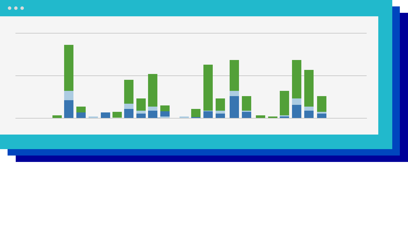
As you can see, there was no real trend line. We didn’t see usage increase or decrease to any significant degree over the year. While there were blips or spikes during special events, the exposure to the office didn’t mean that people then wanted to return more often thereafter.

Attendance also varied by geography. Some offices were consistently visited more frequently than others. For example, our Austin office typically saw higher per capita attendance, even as our other locations were less busy.
Different teams also saw varied attendance, however, this wasn’t always by choice. For example, we saw that the IT department was frequently onsite, but they were also typically required to be in the office to let other employees inside or help with any technical issues. As expected, we also saw that executives seemed to prefer coming into the office.
Across all locations, we were surprised to see that Tuesdays and Thursdays were the most popular days to come in. It makes sense, particularly because Wednesdays are reserved for deep work at Sumo Logic, something that’s usually done best at home. But the data was clear that if we were planning to cater lunches or plan a happy hour, Thursday was far better than Friday.

While we can’t share our final decisions (yet), this data is integral as we are making them. No one can predict the future or truly know what people want to do when it comes to returning to an office. But the data can give us a clearer picture of how people are using the office and give a solid source of truth.
The data about where people are located has also had an additional benefit. Now, when there are natural disasters or civil unrest, we know which employees are most likely to have been impacted. From earthquakes in California to hurricanes on America’s east coast or even the war in Ukraine, we can better predict who was affected. As a result, we can reach out and offer support or resources where needed.
We need the data, in large part because surveys are often unintentionally inaccurate. Comparing the survey answers vs the data, we can see a meta-level of information. Maybe people felt pressured to answer a certain way if they thought their leaders expected them back in the office. Maybe employees truly intended to come into the office more often but found themselves booked with back-to-back Zoom meetings and it simply wasn’t feasible. Or maybe they weren’t planning to come in person but decided to join meetings in the office or were needed onsite to facilitate other activities.
If someone answers a survey saying they’ll be in an office three times per week but ends up coming in once, or five times, that has an impact on facilities, HR, and more.
The data is also pushing the conversation that we all need to have around the purpose of an office. Is the goal to provide a shared location for productivity, or is it built for community and company culture?
The answer to that question can reshape your organization's goals and plans when it comes to distributed work and in-person events.
The main takeaway that we can share at this stage in our decision-making process is that none of us can predict the future. But we can make better decisions when we use modern, data-driven solutions. This was a thrilling opportunity to use Sumo Logic to answer these fundamental questions. You can watch our full conversation below. Alternatively, learn more about how Sumo Logic works.
Reduce downtime and move from reactive to proactive monitoring.
Build, run, and secure modern applications and cloud infrastructures.
Start free trial